COVIDSupport
In the first half of 2020, two of my friends tested positive for the then-novel coronavirus. Though they made full recoveries, the confusion and fear they had expressed while quarantining at home made a lingering impression on me.
My classmates and I sought to ease the uncertainties my friends and thousands of other COVID-19 patients were facing through design.
Role
User interviews, visual design, interactive prototyping
Time
6+ weeks, Fall 2020
For
CS 3891 course project
at Vanderbilt
Discovery and Definition
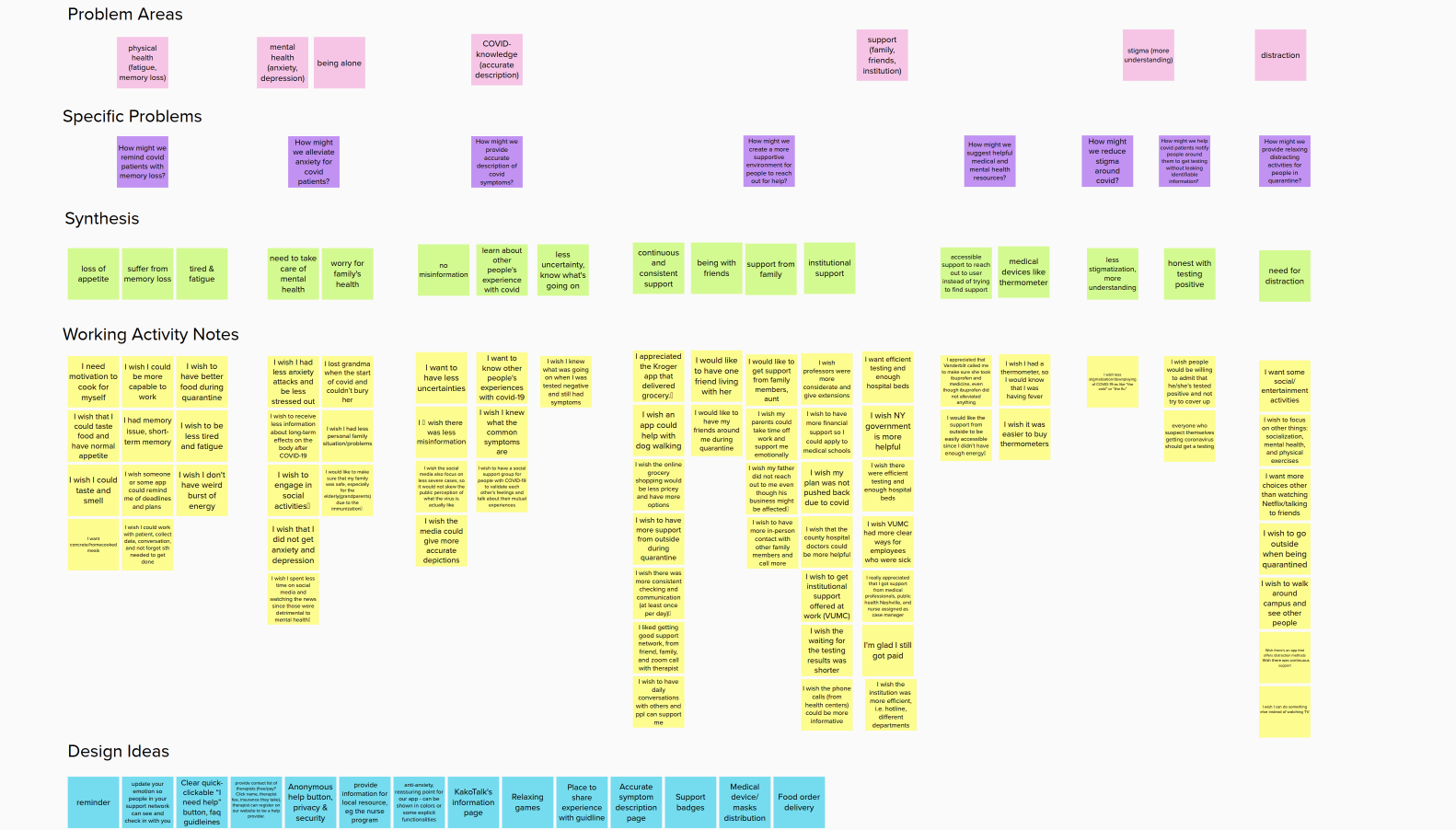
With the pandemic being so new that year, we didn’t know much about where our target users were suffering the most in the quarantine process. To identify these pain points, we sought real anecdotes from interviewees who had tested positive for COVID-19 and underwent the full quarantine experience.
The common pain points among our four interviewees were:
- physical difficulties, such as fatigue
- mental health struggles, such as anxiety
- lack of interpersonal and institutional support, especially with regard to communication and access to COVID-related resources
At the time, brain fog wasn’t a symptom regularly covered by the media I read and watched, so it surprised me the interviewees I talked to reported having difficulties with memory loss and information recall.
That eye-opening finding later informed our feature ideas during our brainstorming session.
Initial Explorations
When we organized our research takeaways through affinity mapping, we also conducted a brainstorming session to address the issues our interviewees mentioned.
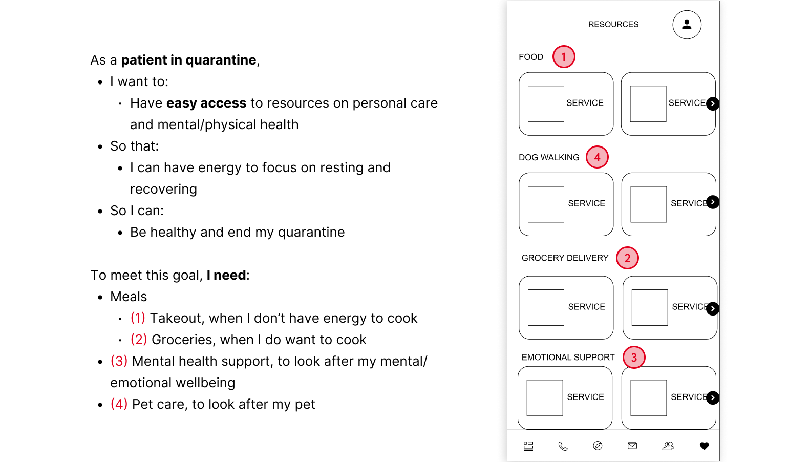
Cards like “I wish I had access to dog walkers and groceries” and "I had short-term memory issues" informed our idea to create a directory of resources. We then linked these cards to the greater goal of our app: facilitating the quarantine process so that patients could have better support for recovery. From these condensed insights, we were able to begin wireframing.
I had the opportunity to contribute to branding while my classmates worked on interactive design for the mid-fidelity prototype. As multiple interviewees had spoken about wanting tranquility and assurance during their quarantine, I chose blue and pink——colors that emulate calm and compassion——for our palette.
Reiterating Around User Feedback
However, simply picking a color palette and calling it a day was not enough for our visual design. As it turned out, visual clarity, or lack thereof, was the biggest hurdle in our usability tests.
One source of confusion was the navigation bar. Through task completion and System Usability Score (SUS) questionnaires, user testing taught us not every icon on the navigation bar was a clear representation of its page, and that the number of tabs on the navigation bar could require more cognitive load.
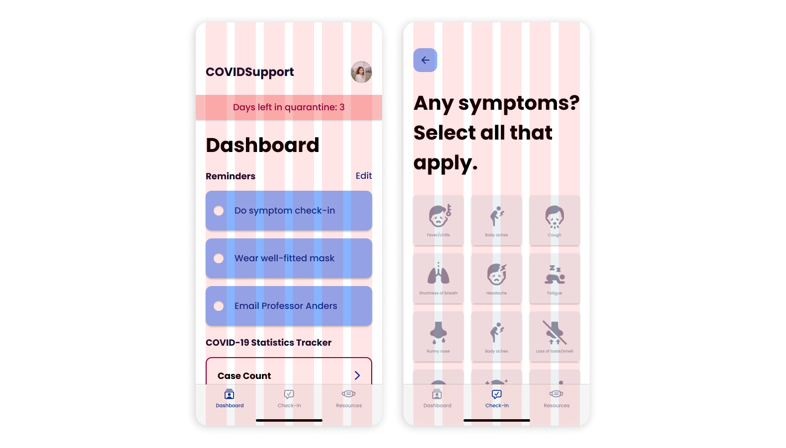
To address these obstacles, I reduced our navigation bar from six tabs to three: the Dashboard feed, the Check-In tool, and the Resources page.
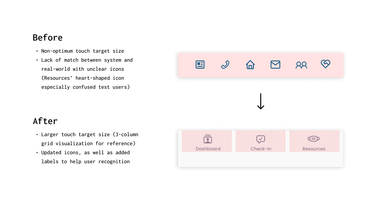
Not only does the reorganization shift the focus of our app to the content that best addresses our users' pain points, it also reduces interaction costs and the navigation bar’s room for error. Research indicated that more than five navigation tabs made it difficult for a navigation bar to retain an optimum touch-target size.
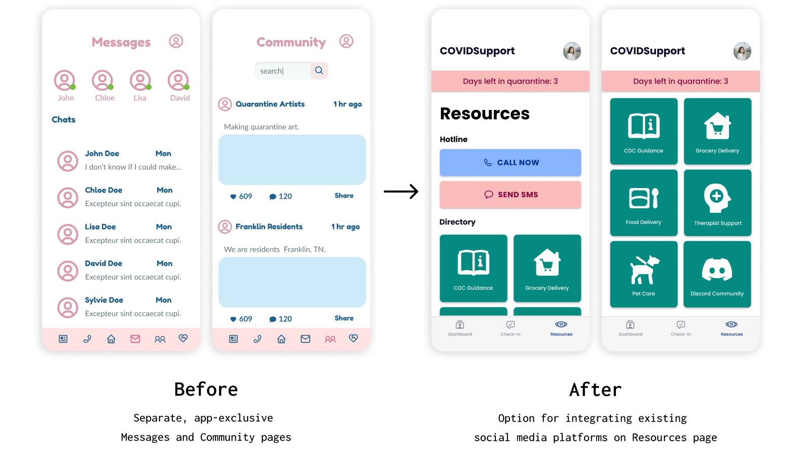
I also removed the Messaging and Communities pages, replacing them with Discord integration instead. We originally created built-in social features to address how interviewees wanted communities that understood how they felt in quarantine, but test users responded that they would rather make use of existing social platforms.
To further improve visual clarity and consistency, I created a design system with reusable components and standardized font sizes in Figma.
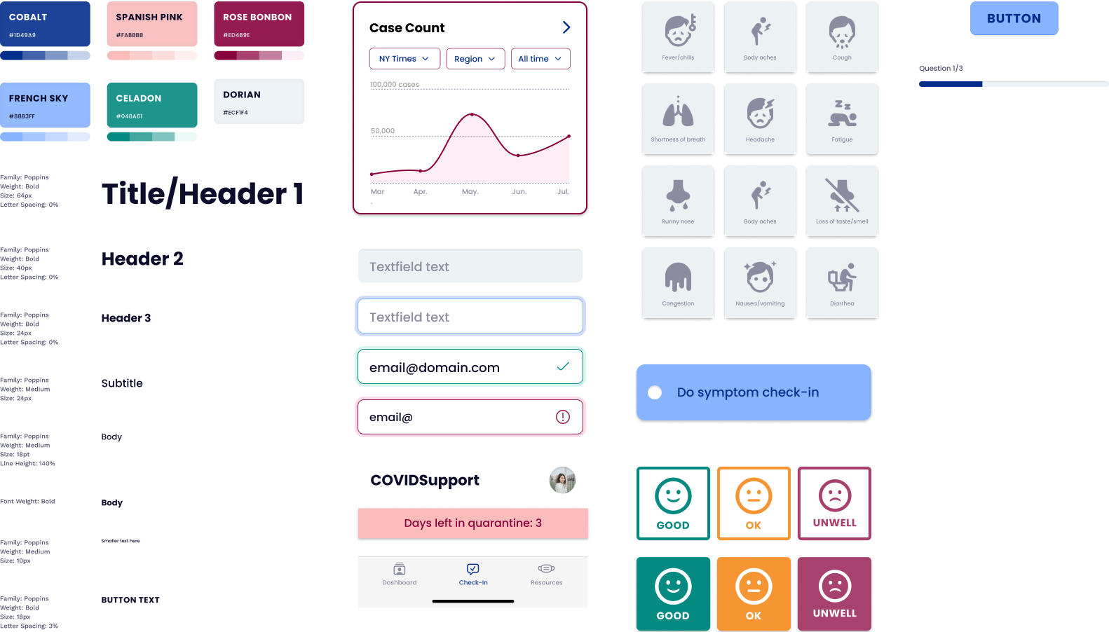
As part of the updated visuals, I added a versatile 6-column mobile grid. Restructuring our UI around the grid created a recognizable spatial pattern that enhances polish. Polish, in turn, can enhance a sense of trustworthiness——important for a medical app meant to relieve uncertainty.
Final Solution
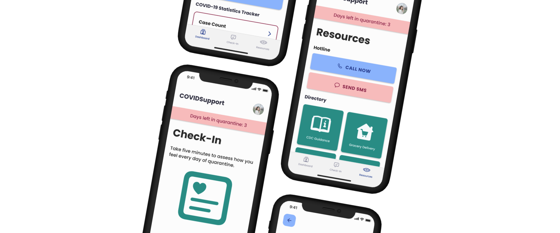
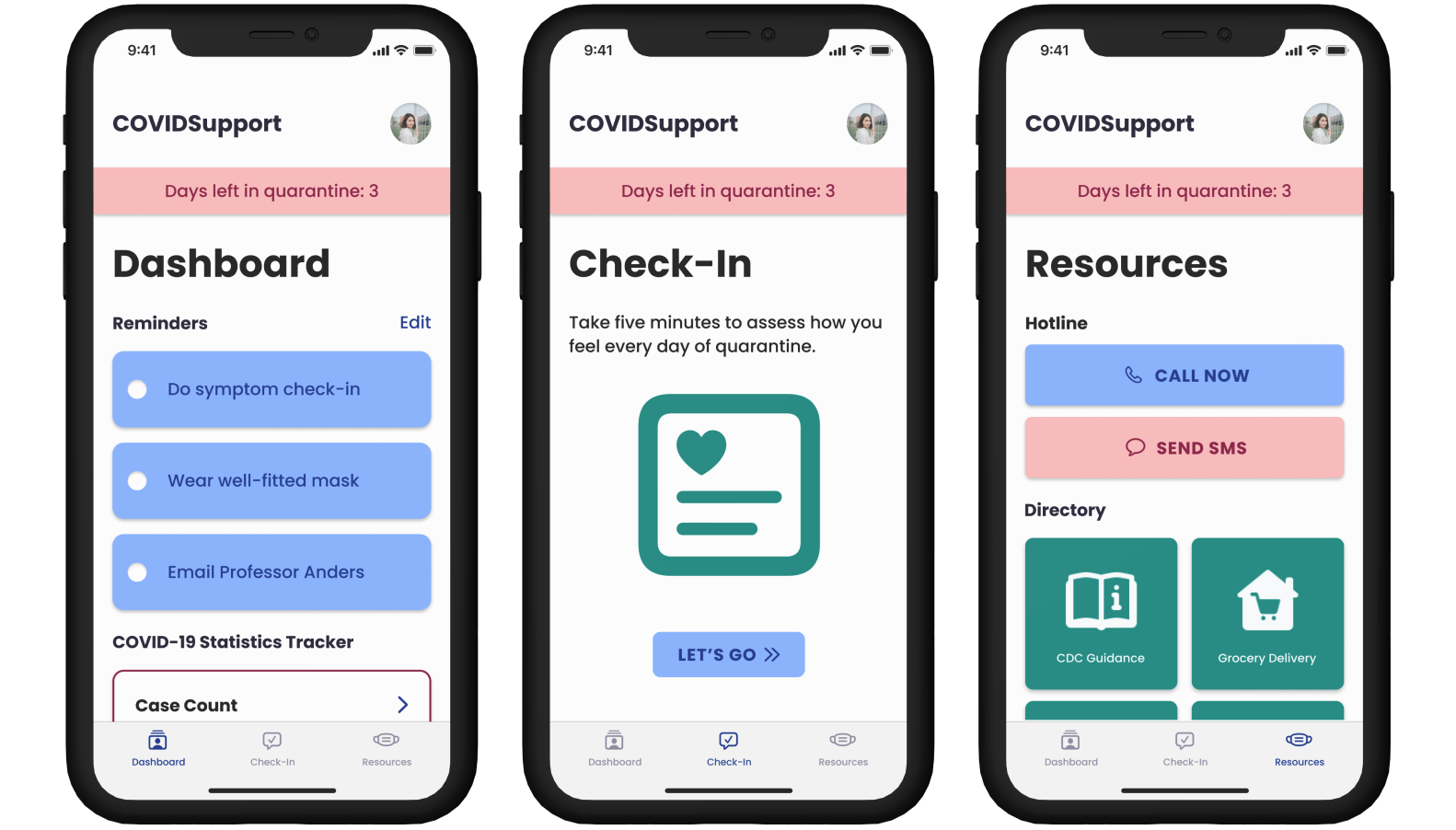
Dashboard
By aggregating COVID-related news and health data, among other widgets like personal reminders, the Dashboard page relieves pressure from users to parse through thousands of sources in the midst of their recovery. In doing so, the Dashboard aids users in finding commuication from institutional support.
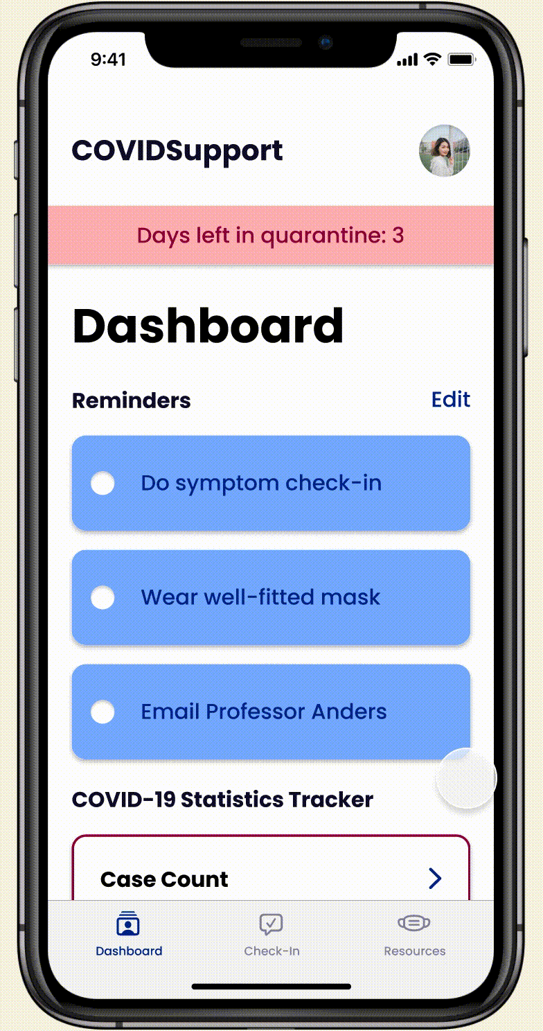
The Edit button at the top of the page also gives users the option to rearrange (or add/remove) widgets from their Dashboard, accounting for what they may find encouraging or draining.
Users struggling with fatigue or short-term memory loss may especially benefit from the Dashboard's features.
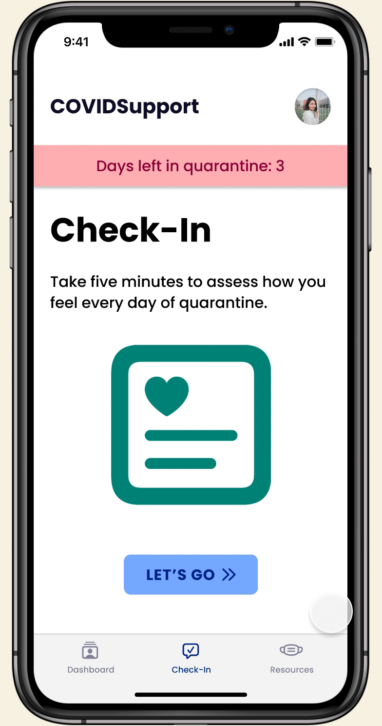
Check-In
For patients in quarantine, the Centers for Disease Control and Prevention (CDC) recommends that they monitor their symptoms throughout their quarantine and for five days after. The Check-In app reminds users to complete a simple and daily catalog of their symptoms and further provides support by directing users to specific resources once they have completed the daily survey.
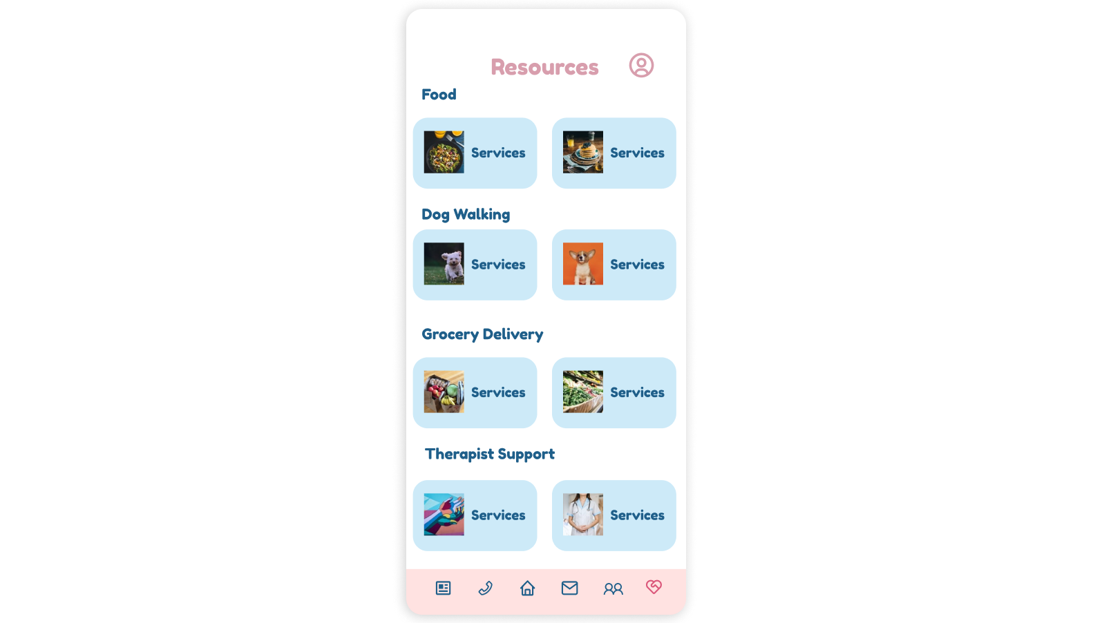
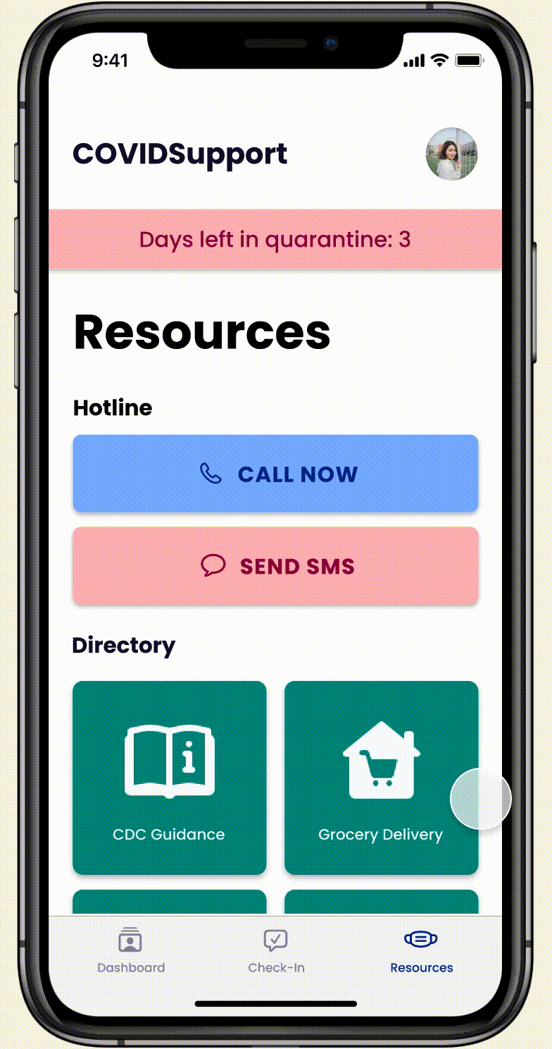
Resources
The Resources page provides users with quick access to a call or text hotline and compiles a directory for users to find COVID-related aid, mental health resources, personal care help, and communities for interpersonal support.
Lessons Learned
Looking Good Isn't Optional
Usability is important, but that doesn't mean usability and visual clarity are mutually exclusive; in fact, user testing taught me that lack of visual clarity could impede usability.
On a similar note, consistency is key. Creating a design system before beginning the mid-fidelity prototype would've been immensely helpful from the start.
Working with a Remote Team
Half of our team was in China, while the other half was in the United States. Working remotely across timezones was a challenge for coordinating user interviews, usability tests, and meetings, but my classmates and I learned to work efficiently through good communication.