Convergence Design System
The Convergence Design System gives PTC's six product teams a shared language of resources and principles to provide users with a cohesive and accessible experience across all PTC products.
My responsibilities included contributing to our Figma component library, collaborating with developers to write documentation for web components, leading workshops to gather requirements and align segments on design patterns, holding office hours to support product owners, and building tools to enhance design workflows and quality at scale.
This case study is a high-level overview of my contributions.
Role
Associate UX/UI Designer
Time
2022 – 2023
Category
Design systems, accessibility
Enhancing the technical
At PTC, I introduced more efficient tooling to our design system through overhauling our design tokens implementation and creating a custom Figma plugin that simplifies a crucial workflow. By fortifying the technical layer of our design system now, I sought to build infrastructure that scales with ease in the future.
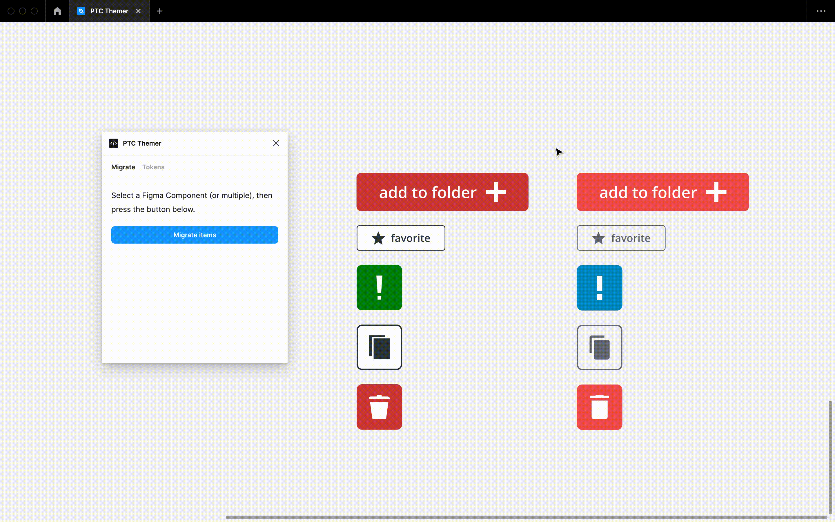
When I joined the team, component theming was handled through a legacy tool that involved inconsistent token taxonomy, frequent build failures, and hours upon hours of manual work. Such inefficiencies ran the risk of cascading technical debt and impeding us from developing new features like a compact mode or a dark theme.
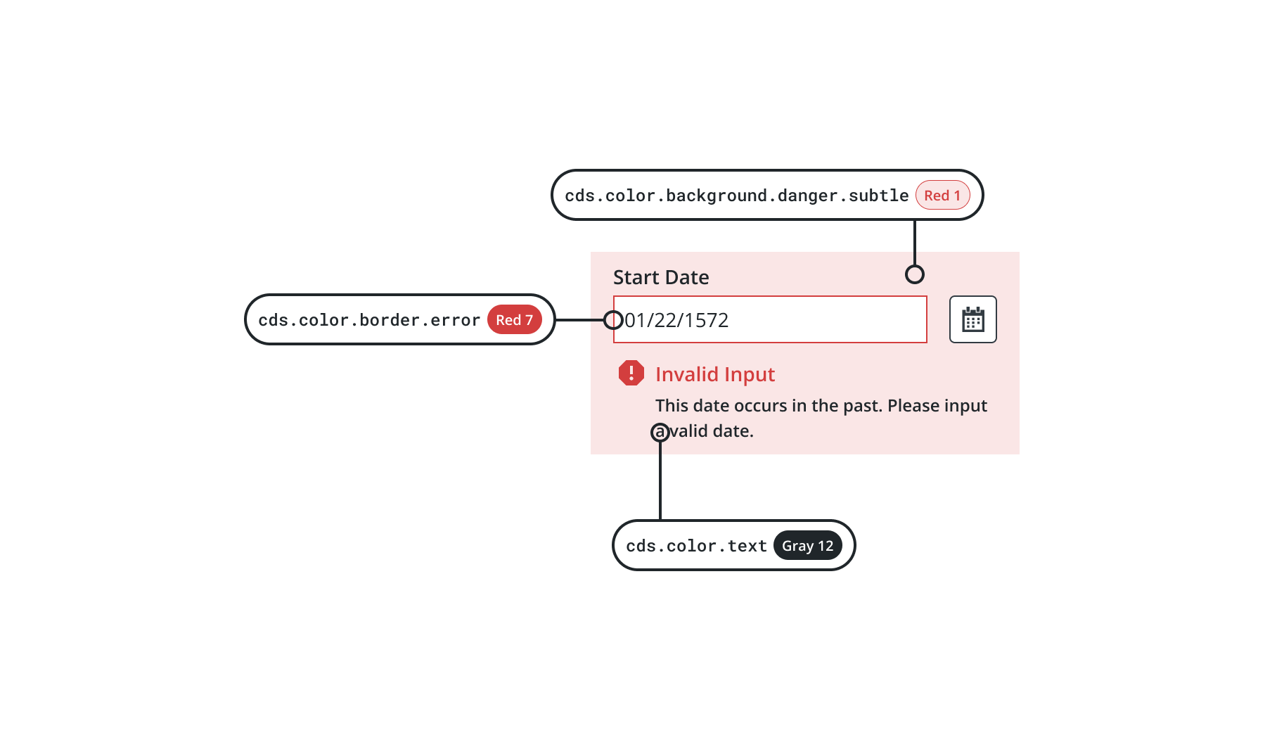
I abstracted our design token taxonomy to be more semantic and reusable, guiding it away from past reliance on primitives and component-specific aliases. With a developer, I strategized a pipeline that would allow the design system team to automate design token updates to the codebase, saving hours of labor.
Contributing to a system of flexibility, reusability, and built-in accessibility
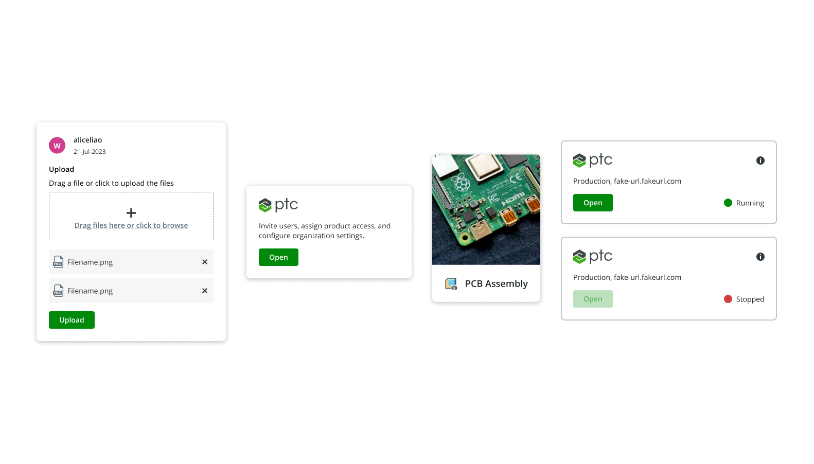
In the four years before I joined, the Convergence Design System was tied to one single legacy product. However, after the design system was given its own team shortly before my onboarding and more PTC products began to adopt the system, we moved toward designing common and adaptive components to better accomodate a wide variety of use cases.
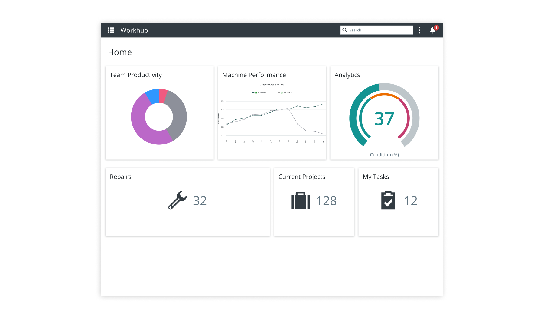
I designed one such component——Card——for teams to use across multiple business areas.
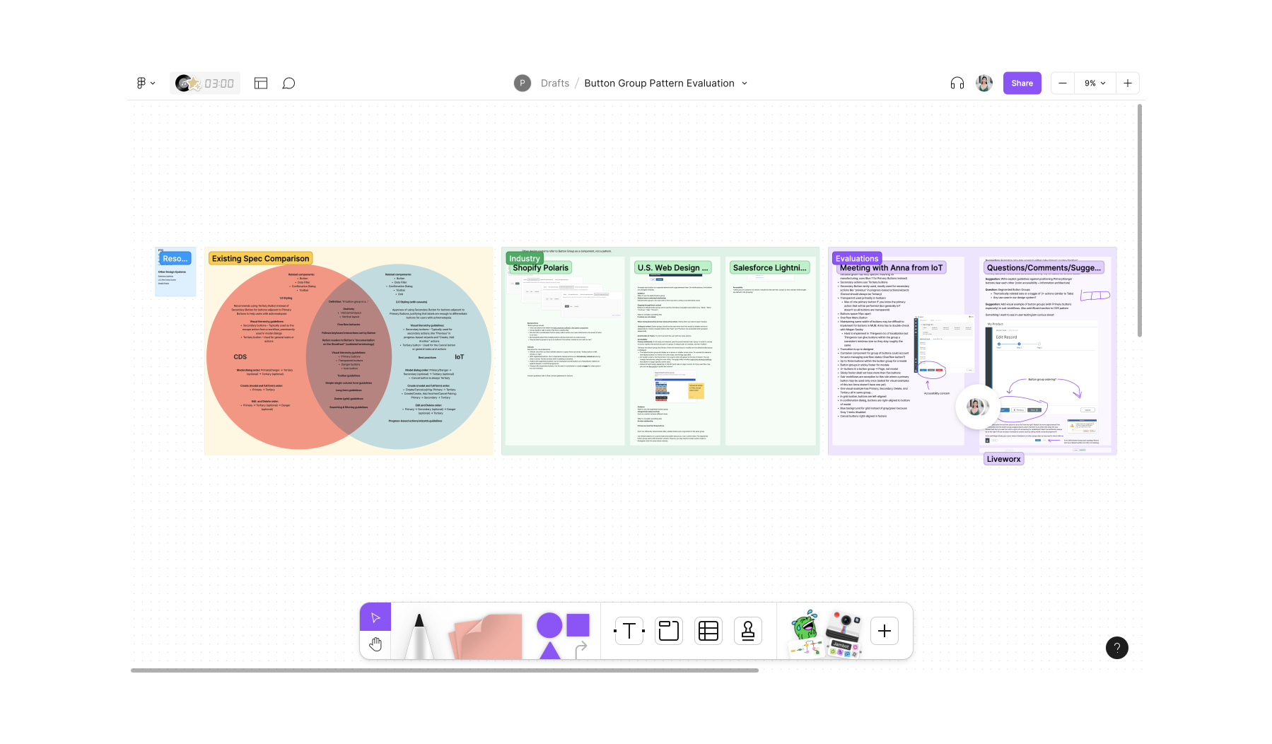
Sometimes, UI components are not enough to address common problems our product teams face. In other cases, they may be too prescriptive. As such, we also began formalizing design patterns: reusable global solutions that allow for both consistency and flexibility.
I wrote a Button Group pattern to address how best to group similar or related actions. Common use cases in PTC products include forms and wizards.
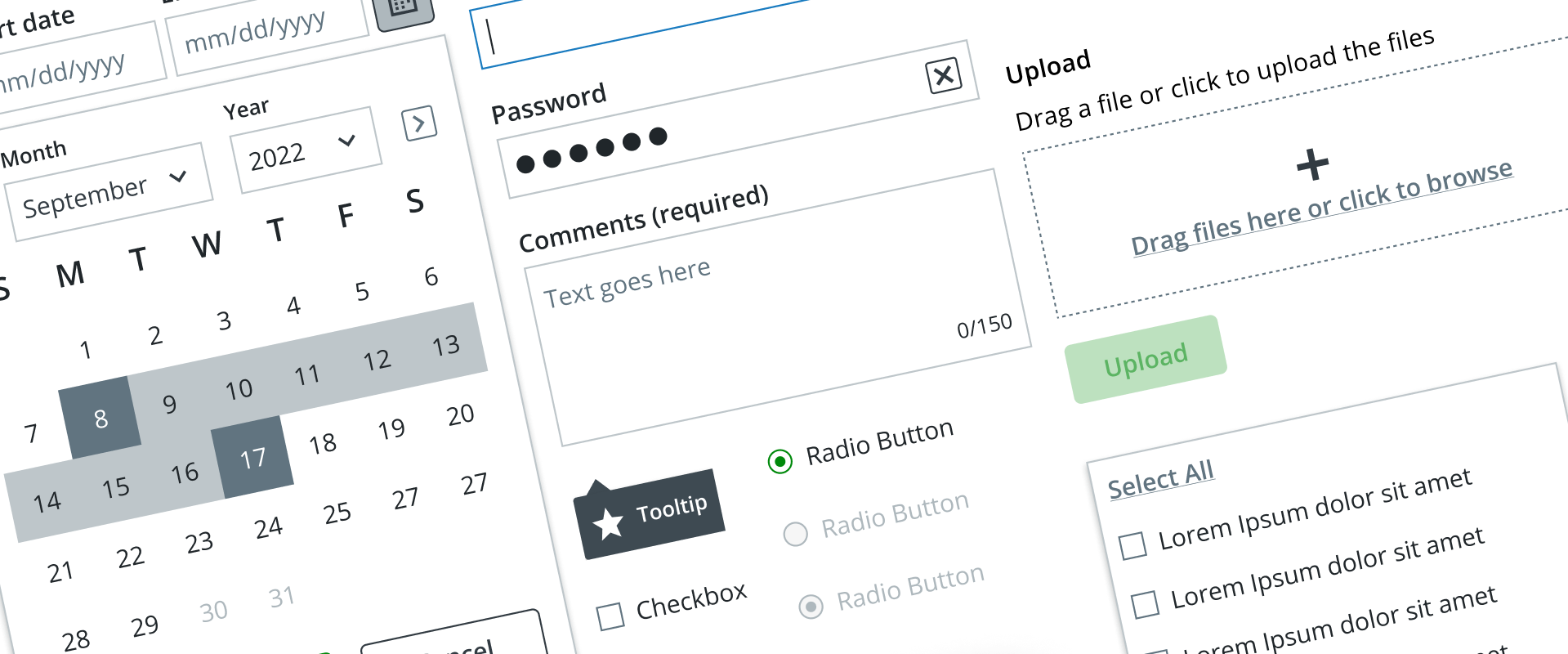
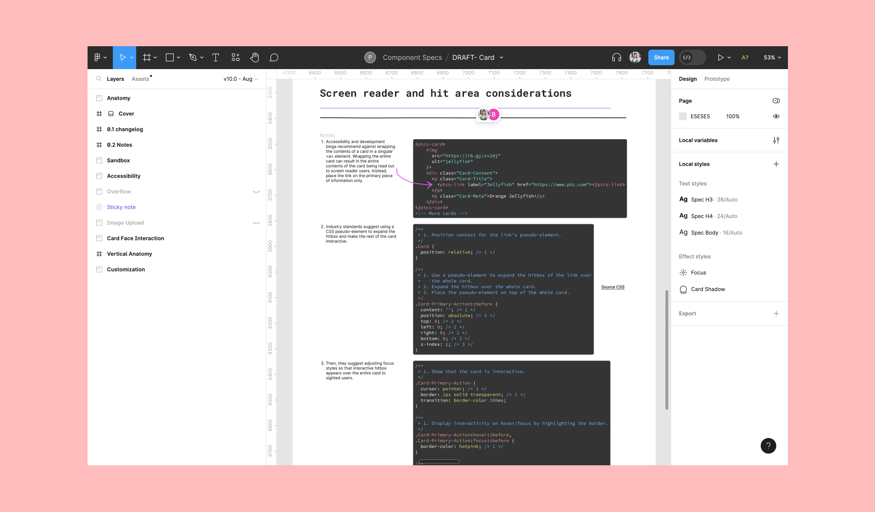
Inherent to designing for people is designing for accessibility. While the Convergence Design System's UI components all satisfied WCAG standards, many PTC products fell short.
From writing keyboard interactions to leading a round table discussion on accessibility, I strove to raise awareness and practice of digital accessibility at PTC on a technical and personal level.
Impact
I saved designers and developers at PTC dozens of hours of work through creating more efficient tooling and workflows. The design system team as a whole, my contributions included, reduced business costs through creating reusable components and patterns. In guiding PTC products toward digital accessibility, our design system encouraged stronger customer engagement.